2024 Wrapped
Take a look back at some of our design system work from the year
Charlie
Phil
Fayadh
Kevin
Inna
Kolt
Key Numbers That Count
K
Figma components mirror the live code components and are an essential part of the design-to-code process.
Design documentation helps our team stay aligned on how to use components and maintain a consistent user experience.
K
Our design documentation website uses a common layout and structure to help designers quickly find helpful guidance.
Figma Component Use Over-time

Projects
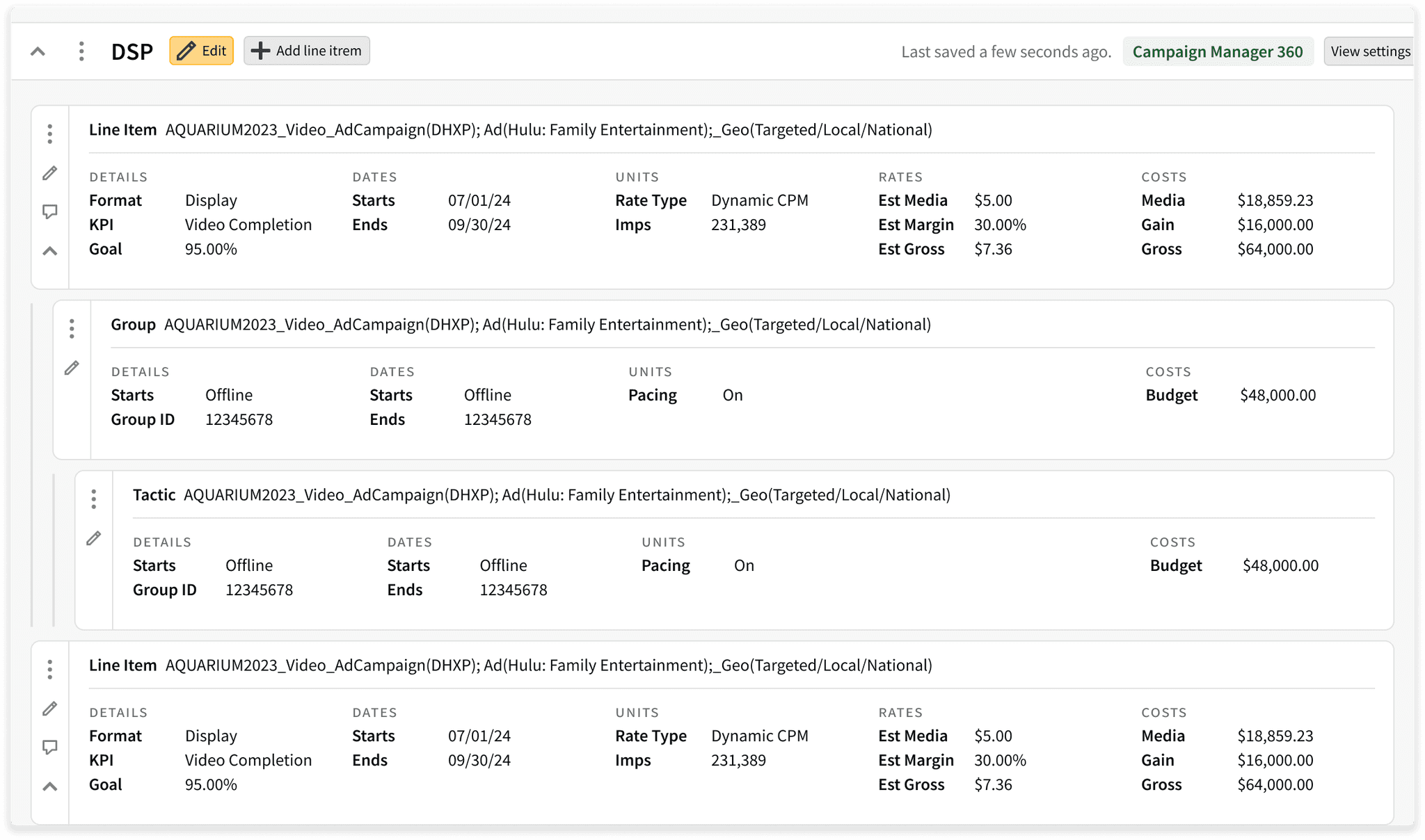
Planning Grid Refresh
This is one of our team’s most significant and ambitious projects yet. We’ve updated the styling and made improvements to the hierarchy, actions, and editing of page line items.
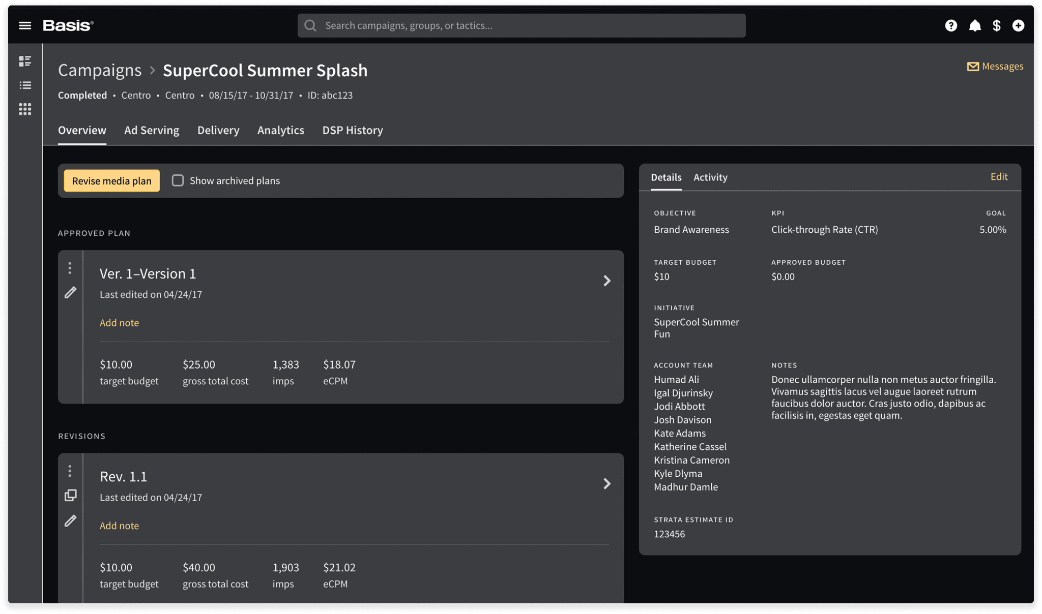
Dark Theme
Another big project this was implementing dark mode across the entire applications. Dark made helps reduce eyestrain and creates a sleek and sophisticated look for an app.
My Settings and Organization Refresh
We've refreshed the the setting pages with updates styles and layouts. As part of our ongoing effort to make Basis responsive, we've also updated the layouts to adapt to small and extra-large screen sizes.
More
Crafting unique and engaging websites tailored to your brand.
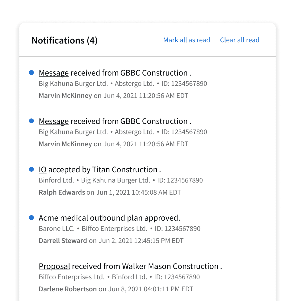
Notification Center
We've updated the notification center styles to match other elevated UI elements.
Storybook
Rebuilt storybook from the ground up in order to upgrade to version 8.
Storybook
Rebuilt storybook from the ground up in order to upgrade to version 8.
Storybook
Rebuilt storybook from the ground up in order to upgrade to version 8.
Date/Time
Removed the deprecated Moment.js library and created a new Date/Time service using the Day.js library, to handle all date/time parsing and formatting.
Date/Time
Removed the deprecated Moment.js library and created a new Date/Time service using the Day.js library, to handle all date/time parsing and formatting.
Date/Time
Removed the deprecated Moment.js library and created a new Date/Time service using the Day.js library, to handle all date/time parsing and formatting.
Updates
See the updates we've made to design systems styles and components.
New Style
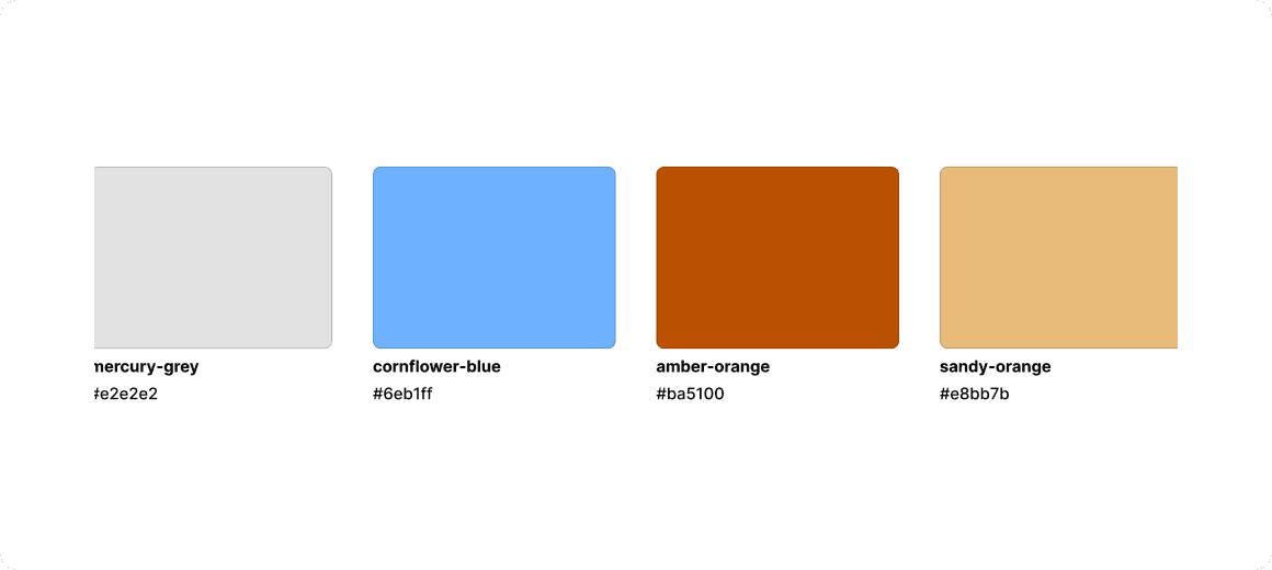
New Color Variables and Border Colors
Added several new colors to better support the wide range of UI elements in our design system.

New Style
New Color Variables and Border Colors
Added several new colors to better support the wide range of UI elements in our design system.

New Style
New Color Variables and Border Colors
Added several new colors to better support the wide range of UI elements in our design system.

New Component
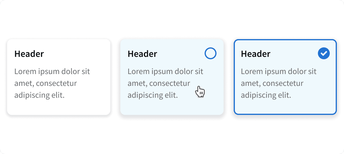
Interactive Card
The Interactive Card is a flexible UI component designed to display content and enable user interactions.

New Component
Interactive Card
The Interactive Card is a flexible UI component designed to display content and enable user interactions.

New Component
Interactive Card
The Interactive Card is a flexible UI component designed to display content and enable user interactions.

New Component
Circle Loader
Created new animated circular Loader component to replace our old “Loading…” text component.

New Component
Circle Loader
Created new animated circular Loader component to replace our old “Loading…” text component.

New Component
Circle Loader
Created new animated circular Loader component to replace our old “Loading…” text component.

Component Update
Message Card Refresh
Updated message cards to be more spacious and removed heavy borders.

Component Update
Message Card Refresh
Updated message cards to be more spacious and removed heavy borders.

Component Update
Message Card Refresh
Updated message cards to be more spacious and removed heavy borders.

Component Update
Badges Refresh
Improved visual design and dark theme compatibility. Also added new variants.

Component Update
Badges Refresh
Improved visual design and dark theme compatibility. Also added new variants.

Component Update
Badges Refresh
Improved visual design and dark theme compatibility. Also added new variants.

New Component
Step Progess Bar Vertical
Updated the Vertical Step Progress Bar to collapse into a side bar on smaller devices.

New Component
Step Progess Bar Vertical
Updated the Vertical Step Progress Bar to collapse into a side bar on smaller devices.

New Component
Step Progess Bar Vertical
Updated the Vertical Step Progress Bar to collapse into a side bar on smaller devices.

Component Update
Title Bar Breadcrumbs
Added support for more than three page breadcrumbs, which will collapse into an overflow menu.

Component Update
Title Bar Breadcrumbs
Added support for more than three page breadcrumbs, which will collapse into an overflow menu.

Component Update
Title Bar Breadcrumbs
Added support for more than three page breadcrumbs, which will collapse into an overflow menu.

New Documentation
See the new documentation pages we've published this year.
Feedback
Read the glowing reviews from our happy clients and partners.
On App Dark Theme
"Just wanted to throw a shout out to Charlie Thomason and Fayadh Ahmed (and anyone else who works on Design System) for their work on Dark Mode. I was just on a call with a few VPs from Boundless Search Leadership and we were going over some features and happened to be using Dark Mode. They explicitly called it out and one of them mentioned he will be doing all his product demos using Dark Mode now. We don't always get that feedback directly from people who use the platform every day. Major kudos on this! Fantastic stuff."
dir, software engineering, Basis
"I heard before that implementing dark mode can be very challenging, to the extent that many platforms don't do it just because it would be too much work. Charlie Thomason and Fayadh Ahmed did it in record time. As odd as it sounds, it feels great to work on a platform that has dark mode, and I'm glad we can impress our clients with it"
sr software engineer, Basis
On Planning Compact Mode
"I can see most of my tactics now and I can see a lot more than I could before. So I can check my dates really quick. Pacing budgets for the most part. All in one view again, which is great. With the compact view, it's easier to see the differentiation between the line item, the group and the tactic."
Miles Partnership
"The compact view does help a lot. The biggest thing was the differentiation. It was much easier with the indentations. It just seemed like the eye could see the indentations much easier. So you look at it and immediately you could see the line item, the group and then all the tactics."
Miles Partnership
Coming Soon
See what's coming next!
Creative Mapping Refresh
The DSP creative mapping screen will be updated to match the new look and feel of the planning grid.
Thank You
Meet the creative minds powering the design system.
Charlie

Charlie

Charlie

Fayadh

Fayadh

Fayadh

Inna

Inna

Inna

Kolt

Kolt

Kolt

Phil

Phil

Phil

Get in Touch
Reach out to us with any design system questions or suggestions.
Slack Us
#design_system
Design Documntation
design.basis.com
Development Documentation
storybook.basis.net
Get in Touch
Reach out to us with any design system questions or suggestions.
Slack Us
#design_system
Design Documntation
design.basis.com
Development Documentation
storybook.basis.net
Get in Touch
Reach out to us with any design system questions or suggestions.
Slack Us
#design_system
Design Documntation
design.basis.com
Development Documentation
storybook.basis.net
